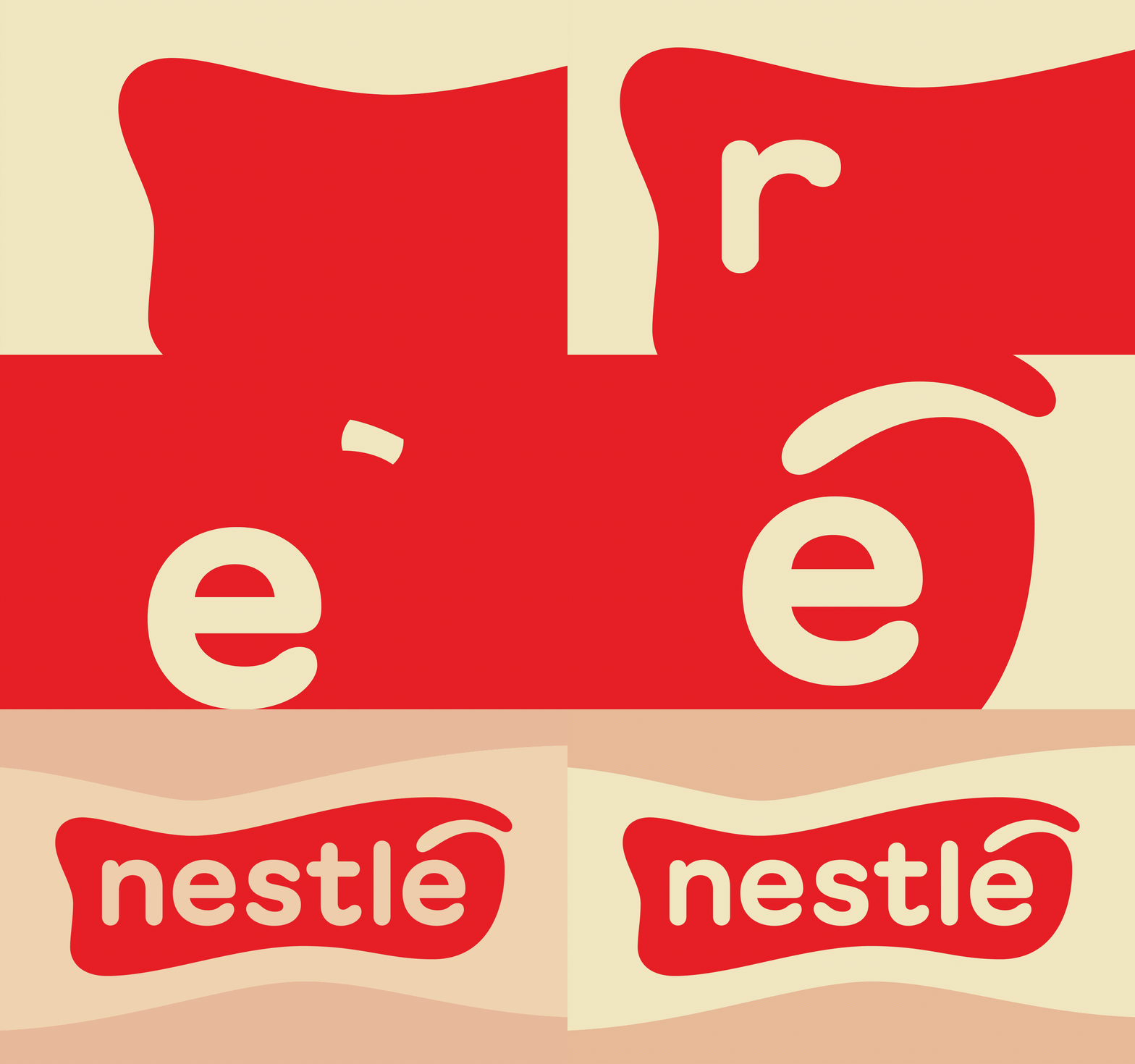
NESTLÉ REBRAND

I tasked myself with rebranding a large company, and eventually landed on Nestlé. Inspired the brand’s origins as a global dairy company, I developed an identity that centers around milk and cream as the main motifs. Not only do these inherently tie back to Nestlé’s roots, but it also brings a very warm and welcoming feel to its image. This influences the main icon, color palette, and essential graphic forms that are used in the various applications yielded by this rebrand. GT Maru Bold from Grilli Type, a comptemporary Swiss foundry, is used for the icon. A font from them felt like the perfect transition from Nestle’s classic use of Helvetica.
