PROJECT: Q

Grid systems are used heavily throughout all applications of graphic design, whether that be in books, web interfaces, or logos. During the early days of digital computing and print, bitmapped grids were also used to make existing typefaces available on-screen. Inspired by the oddly asymmetrical uppercase letter “Q” of VT-100, I set out to explore a much more systematic and spiritual approach to type design.
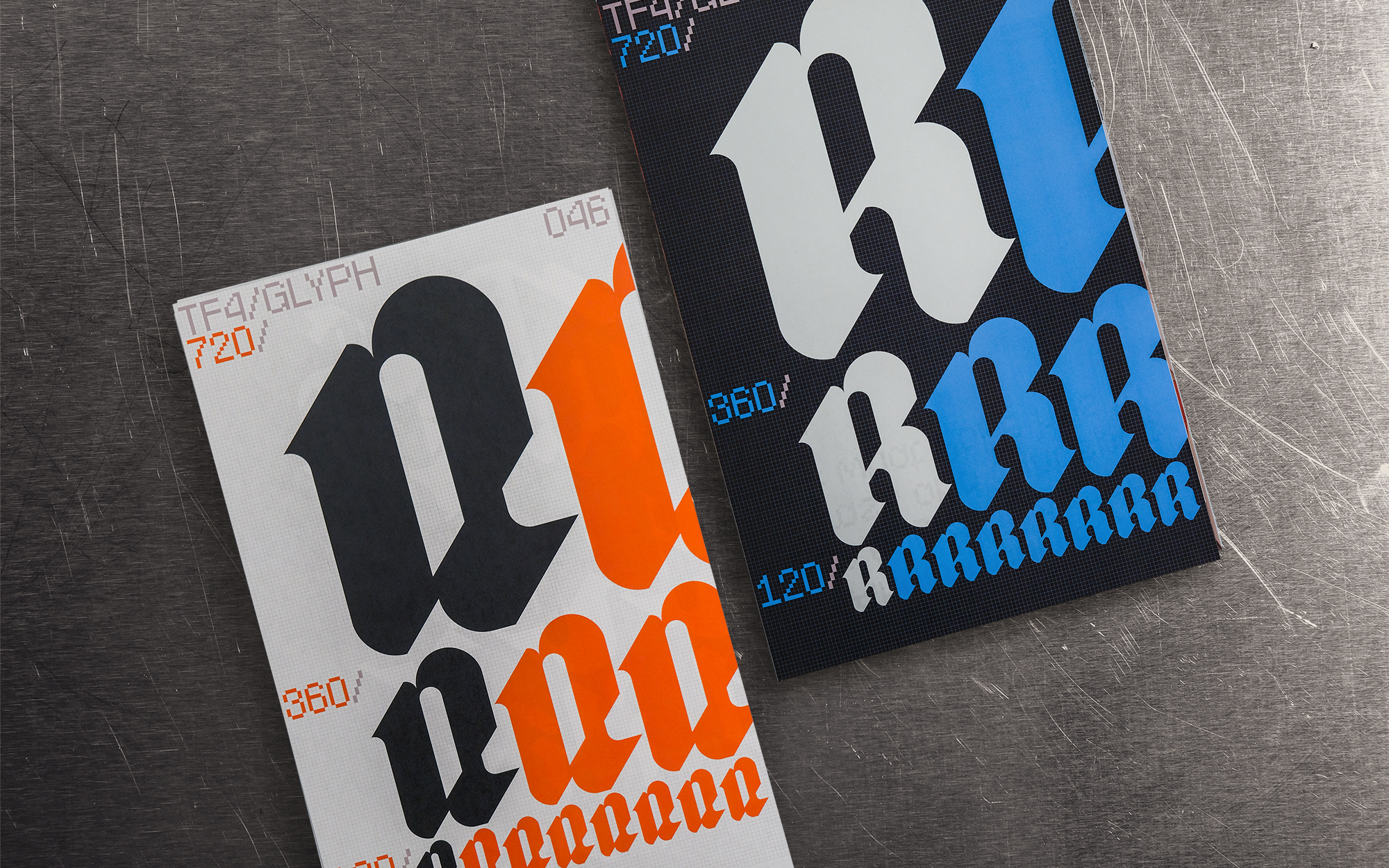
“Project: Q” is a collection of the experiments I conducted using grids of varying unit sizes. The final outcome is a selection of typefaces that explore the restrictions of resolution as it relates to designing letterforms. These typefaces, named Brick, Curve, Inflex, Tilt, Poke, and Warp, each focus on a different type style in order to exhibit these ideals. The first book of this series acts as a type specimen hosting all of these character sets, ruled by an omnipotent grid that every element of the layout aligns to. Additionally, I mocked up a handful of 3D motion graphics and posters that embed my typefaces onto grids existing in the real world.
